
We design to elicit responses from people: either to buy something, read more, or take action of some kind. Designing without understanding what makes people act the way they do is like exploring a new city without a map: results will be haphazard, confusing, and inefficient.
These two books combine real science research with practical examples to deliver a guide every designer needs. With it you’ll be able to design more intuitive and engaging work for games, websites, applications, and products that matches the way people think, work, and play.
Learn to increase the effectiveness, conversion rates, and usability of your own design by finding the answers to questions such as:
- What grabs and holds attention on a page or screen?
- What is more important, peripheral or central vision?
- How can you predict the types of errors that people will make?
- How do you motivate people to continue on to the next step?
- What is optimal line length for reading? Are some fonts better than others?
You can preview my highlights from 100 Things Every Designer Needs to Know about People and 100 More Things in the meantime.
How People See
01 What You See isn’t What your Brain Gets
Your brain creates these shortcuts to quickly make sense of the world around you. Most of the time it works, but sometimes it doesn’t.
The Gestalt PrincipleWe can use Gestalt closure effect to make our design more elegant. (Or connectedness for worse in KIA)

02 Peripheral Vision gives you the Gist
Due to anatomy of our eyes, we have different “resolution” for center and peripheral vision. In the center are the cones, which are very good at distinguish color and details. Rods spread out from the center and are sensitive to movement and light (but not color).

That why ads at the edge of your browser are blinking and flashing. You can also use peripheral vision to alert users of incoming danger in your game.

When designing website for desktop, use peripheral elements to give visitor the feeling of the site: green forest for nature products, fresh ingredients for restaurant…

Use peripheral vision to give the feeling of the site.
03 We identify Objects by Geons
According to recognition-by-components theory by Irving Biederman, we don’t remember objects one by one. Instead, we identify objects by combining simple geometric shapes, or geons.
Therefore, objects that use simple geons are easier and faster to be recognized.

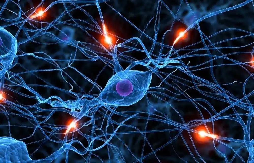
04 Our brain has a specialized part to Recognize Faces
Identified by Nancy Kanwisher (1997), the fusiform face area (FFA) bypass usual channel for objects, help us identify faces more quickly.Research by Karen Pierce (2001) show that people with autism do not use FFA when looking at faces. Instead, they use the regular pathway.

People mainly use the eyes to decide if human is alive or not.Uncanny Valley in Game Design

05 And other parts for processing Simple Features
Scientists long known that visual cortex in our brain has special parts for processing simple visual information: line, line tilted at 40°, edge, color, motion… Then all data are combined into just two tracks: one for movement, another for location.
Yet in 2019, Garg shows that our brain might process two features at the same time: color and orientation.


Instead, using less, or just one feature: color, shape, orientation… may give better result.
06 We have Mental Models of How things work
Well, most people don’t start by looking at left topmost, because they have a mental model of how websites were designed in general.
- Topmost is usually reserved for menu, search bar, settings, etc.
- Sidebar is for related articles, or advertisements, or sidenotes in this site.
- Instead, they look about 30% from the top and 30% from the edge.
- Therefore, use these edges to give peripheral vision02 the “gist” of the scene: logo, branding, theme,…
- Then they read from left to right or right to left, depending on their language.

Organize information in a smooth navigation path with headings and images for resting.
Don’t force user to look back and forth across screen.
Design for scanning and skimming, not just for reading.
This site was designed for focused reading with single column & sidenotes.
07 Give me a Clue
In 1988, Don Norman refined the idea of affordances in The Design of Everyday Things, which states that if you want people to take an action on an object, you must ensure they can figure out what they can do with it.
We all encounter doors that have a pull handle but can only be pushed; flat button that is indistinguishable, hyperlinks without clue, in minimalism trend championed by Apple.Minimalism is overrated

08 People can Miss Changes on screen
Let’s watch below video first.
Our attention is very limited. We can hold about 4±1 items20 in our working memory, therefore easily missed changes unless we paid attention.
In fast action games, Diablo 3, League of Legends, you usually have 4-6 skills to remember.


Use animation and sound to capture user’s attention
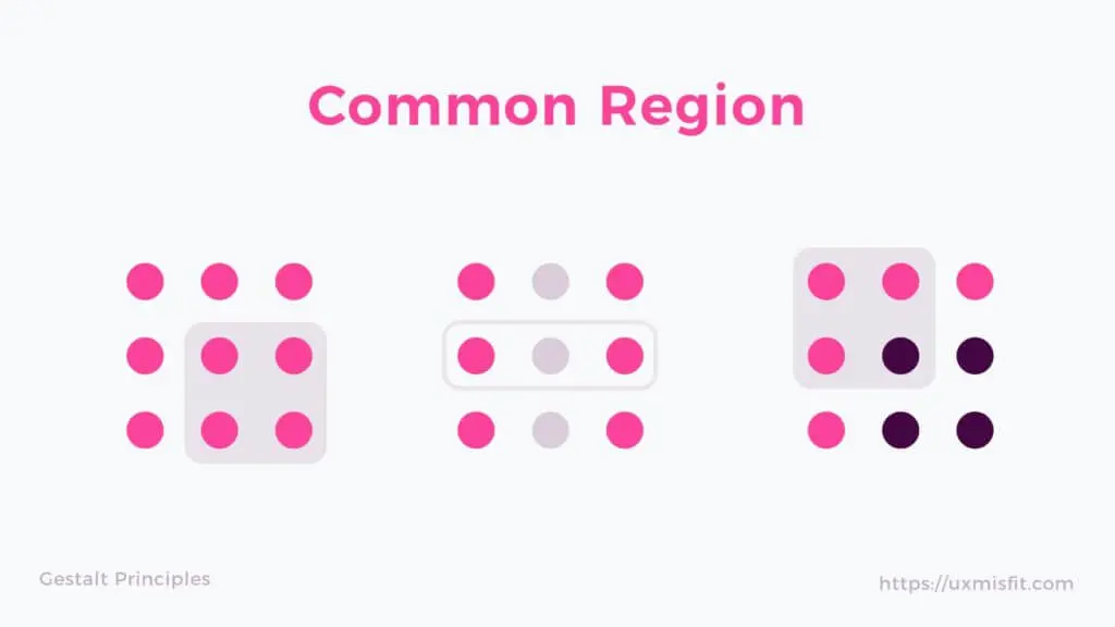
09 Things that are Close together Belong together
Gestalt Proximity Gestalt proximity principle is the most important principle in UI design since it can keep UI clean and functional. Gestalt Common Region Proximity is stronger than similarity and can only be overridden by common region , which added more visual noise to the design.


10 Red and Blue together are hard on eyes
Chromostereopsis is a visual illusion when color with wavelengths that are too different put near or on top of each other, most commonly happening with red-blue, red-green.
Just Don’t!
11 Nine percent of Men is Color-Blind
Evolution of Eye In order to understand color-blindness, we must understand how we see color:- We have three types of cone cell for red, green and blue.
- Each cone cell can distinguish about 100 shades, which help us see about 1 million colors.Some people with an extra cone, Tetrachromacy , can
see 100 million colors - Genetic disorder to one or more of these cone cells cause color-blindness , as they cannot tell the difference between red-green or blue-yellow.

You can test color-blindness with the Ishihara Test at your optometrist.

Always use redundant coding scheme besides color: texture, shape... to ensure accessibility.
12 Colors have Different Meanings in Different Cultures
When picking colors for your design, you must consider their meanings in different cultures.
Look at the chart below and you can see they rarely share the same meaning, e.g, Black for Evil, White for Truce… Green may mean good luck in America, but Red is the lucky color in China.

How People Read
13 Is ALL CAPS harder to read?
The Science of Word Recognition Let’s look more closely at how we read.First, we do not recognize words by their shape, but pattern of letters, especially first and last. At any time, we can only read about seven to nine letters, but use our peripheral vision to read ahead about 15 letters.

Second, we do not read in a linear fashion, but in saccades (jumps) and fixations (stops). We also jump back 10 to 15 percent of the time to check for errors.


These days, we also perceive ALL CAPS as shouting, so use it sparingly.
14 Reading and Comprehending are Two Different Things
Legibility, Readability, and Comprehension Reading requires you to recognize the letters and words. But understanding requires you to form the meaning of a sentence or paragraph. This usually requires your previous knowledge of the subject.There are many readability fomulas to calculate difficulty of reading, but they mostly focus on vocabulary, number of syllables, length of sentence… and therefore are not very accurate.
Titles and headlines are critical for understanding, because they let readers know about the context.
15 Which are More Legible: Serif or Sans Serif?
Which are More Legible? Short answer: Neither. Research shows little difference in comprehension, reading speed or preference between them.We identified letters through pattern recognition03, i.e strokes & curves of letters. Therefore, too decorative typefaces (script, handwritten) may interfere with our recognition, serif or sans.

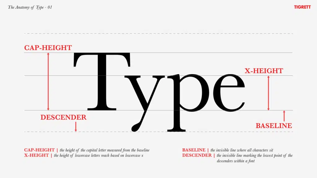
16 But Font Size Matters, A Lot
When it comes to font, size matters a lot more than typefaces.
iOS GuidelinesAndroid GuidelinesWhen designing for mobile, follow Apple (15-17pt for body) and Google (14-16sp for body) guidelines for typography specifications.
You should pay attention to x-height when choosing fonts. The higher x-height, the bigger it looks.
17 Reading on Screen is Harder
Text and images on screen are constantly refreshed (60Hz, the higher the smoother); and electronic screen is also emitting light, which is tiring to our eyes.
Make sure to use large font size16 and enough contrast between foreground and background.
Dark Gray (#1b1b1b) on White (#ffffff or #f7f8f9) is the best.
Brown (#4f321c) on Tan (#f6f0e2) to simulate paper. Serifs to boost.
Light Gray (#d0d0d0) on Black (#000000) for dark mode.
Or Light Gray (#d6d6d7) on Dark Gray (#4a4a4d).
Black on White contrasts too much.
18 People Prefer Shorter Line (45-72)
Line Length revisitedAlthough they read faster with longer lines (80-100 characters per line), since they interfere less with the flow of saccades and fixations.But in the age of mobile, the line is only getting shorter because of infinite scrolling, and/or people stop reading altogether.

How People Remember
19 Short-term Memory is Limited
Our working memory is very limited and tied to our attention. The moment you are distracted, gone is your working memory.
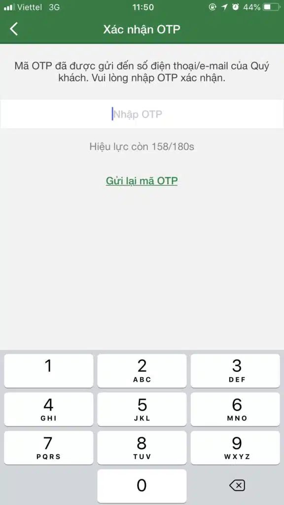
As a designer, you should never force user to remember22 something and key it in later. I saw this practice with a lot of banking app: they would not allow pasting OTP from your text message.

20 We Can Only Remember 4±1 Chunks at Once
The magical number seven plus or minus two (1956) by G.A. Miller is probably the most cited paper about our working memory, but was usually misinterpreted Seven as our limitation. The right number is more likely to be 4±1 chunks.
This does not apply to number of items or options that are visible on screen, only chunks in our memory.

21 We Use Schemata to Store Knowledge
There are basically two ways to turn working into long-term memory:
- RepeatMemories are just patterns of connection between neurons. The more we recall our memory, the stronger its connection (and our memory) becomes. This is why we need to repeat information over and over to make it stick. it a lot (learning vocabulary, multiplication table…) when you started to learn something new.
- ConnectThis also explains why it is easier to form new memories that are related to the old one: expand firing patterns is easier than forming new ones. it to something you already knew (reading a story to understand the context) to create a metal model or schemaplural: schemata.. The more experienced we are, the more complex our schemata become.
Doing user research help designer to understand user’s schemata and work from there.
22 Regconition is Easier than Recall
Recognition is easier than recall because it makes use of context, information at the moment. To make thing worse, most of us uses Google as our external memory , which accelerates our forgetfulness.
This is why autocorrect and autofill enhance user experience: by letting users choose from a list of available options.


No more keying PIN codes from text message.
23 Our Memory is Susceptible to Error
There are many interesting features about our memory, but reliability isn’t one of them:
- We can’t remember much before the age of 3 because our hippocampus hasn’t matured yet.
- We have better visual memory than semantic memory (knowledge)
- We remember concrete words (apple, chair) more easily than abstract ones (justice, democracy), partly because of visual memory aids.
- We tend to remember the firstPrimacy effect and the lastRecency effect items in a list.
- Sleeping help us to consolidate our experiences during the day. But we couldn’t decide what to remember, our brain does. 😂

Aim at “just right” abstract-o-meter icons.
Recap at the end of a presentation.
24 We Reconstruct Our Memory Every Time
We can’t remember much events happened before the age of 3 because our hippocampus hasn’t matured yet. But when we can, it turns out to be faulty too.
Recalling an event in the pastEpisodic memory is unlike playing a movie on your phone. Instead, we reconstructed that event using pieces of information, every single time. An analogy is to direct a movie every time you view it.
Be careful with wordingPriming effect of your questions, try to be as neutral as possible.
25 Forgetting is a Feature, Not a Bug
Forgetting seems to be such a problem. At best, it’s annoying (where did I put my keys?), and at worst it can send the wrong person to prison with inaccurate eyewitness testimonies.
Why are our memory so flawed?
It isn’t a flaw, but a feature. If you remembered all the experiences, you’d be overloaded. Therefore, your brain must unconsciously decide what to remember and what to forget. Sometimes it isn’t very helpful, like remember your last quarrel with your wife, but forget her birthday before that altercation.
Forgetting Curve

Don’t show all tutorials on user’s first login but just in time when user needs it.
26 Vivid Memories are Not Trustworthy
Remembering traumatic or dramatic events in great detail is called flashbulb memory. Emotions are processed in the amygdala, which is very close to the hippocampus, which is involved in the long-term coding of information into memories. So it’s no surprise that emotionally laden memories might be very strong and remembered vividly.
But they are also full of errors. It turns out that those lightbulb memories are as susceptible to the forgetting curve as any others. We are just more confident about them.

How People Think
27 We Process Information in Bite-Sized Chunks
Although our brain can handle a lot of information, only a tiny portion of it reaches our conscious awareness. To make thing worse, we can only hold about 4 items20 in our working memory.
Therefore, when presenting a substantial amount of information, you should break it down into bite-sized chunks, then progressively disclose them, like accordians on this page. Avoid hamburger menus if you can.
Instead of showing all features, we should show only the most important ones, and hide the rest for a cleaner UI and better UX.
28 Cognitive > Visual > Motor Loads

29
30
31
32
33
34
35
36
37
38
39
How People Focus
40
41
42
43
44
45
46
47
48
49
What Motivates People
50
51
52
53
54
55
56
57
58
59
60
61
62
People are Social Animal
63
64
65
66
67
68
69
70
71
How People Feel
72
73
74
75
76
77
78
79
80
81
82
83
84
People Make Mistakes
85
86
87
88
89
How People Decide
90
91
92
93
94
95
96
97
98
99
100